
Protect Your Investment. Prevent Costly Repairs. Enjoy Peace of Mind.
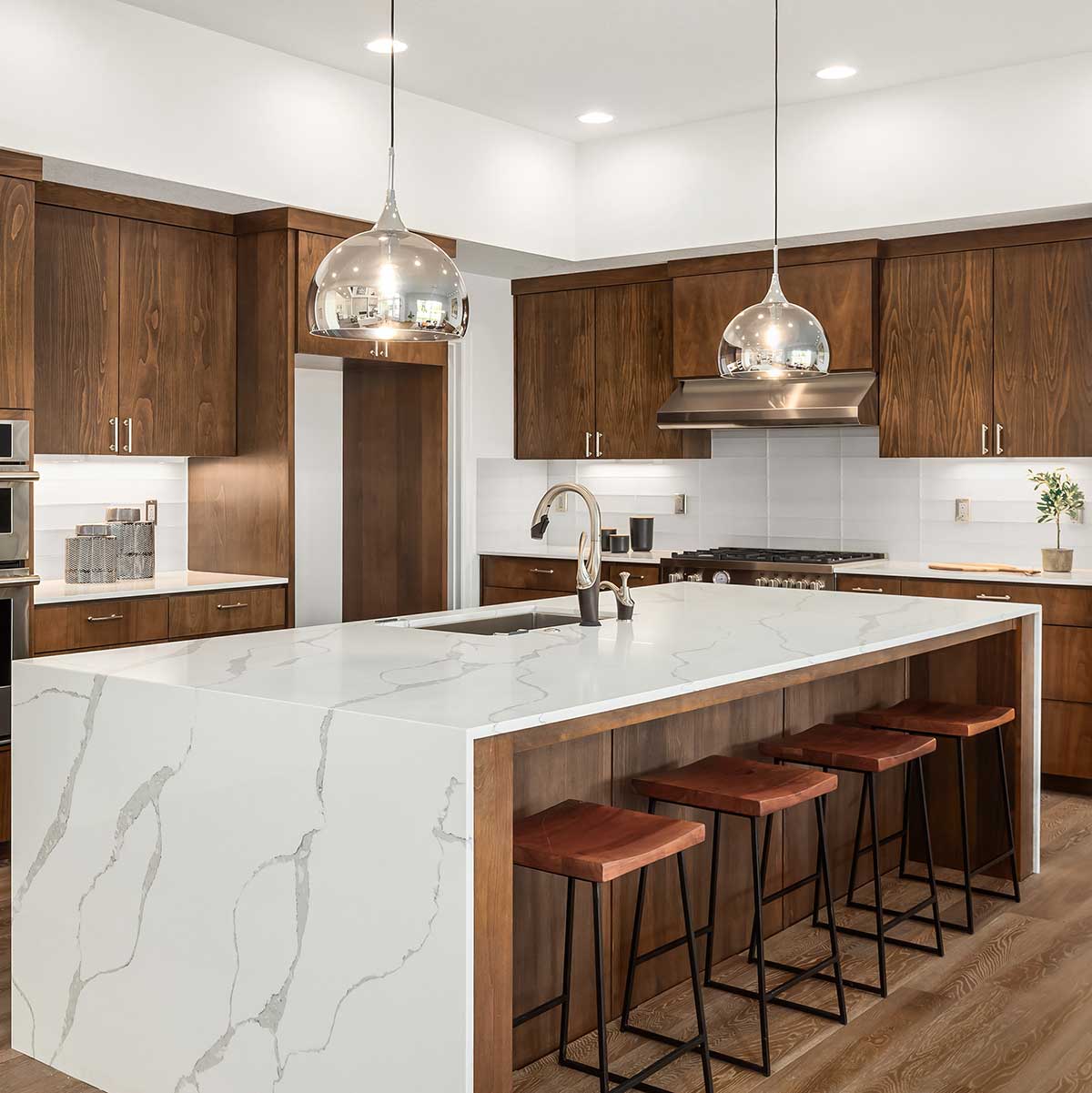
Your home works hard for you every day—and like anything of value, it requires routine care to remain safe, efficient, and beautiful. Our Interior Maintenance Program is designed to identify small issues before they become costly problems, ensure critical systems are operating properly, and preserve the long-term value of your home.
This proactive service is ideal for homeowners who want peace of mind, reduced repair surprises, and a well-maintained living environment year-round.
What's Included
- Smoke Detectors & Batteries
Inspection and replacement of smoke detectors and batteries to ensure proper operation and safety compliance. - Kitchen Disposal Inspection & Cleaning
Cleaning and inspection to prevent odors, clogs, and premature wear. - Appliance & Ventilation Maintenance
Vacuuming of refrigerator condensers and bathroom exhaust fans to improve efficiency and extend equipment life. - Door & Window Hardware Tune-Ups
Adjustment and alignment of hardware to ensure smooth operation and proper sealing. - Cabinet Hardware Adjustments
Inspection and tightening of hinges, pulls, and fasteners to prevent sagging and long-term damage. - Countertop & Shower Grout Inspection
Review of grout and sealant conditions with minor repairs to help prevent moisture intrusion.
- Plumbing Angle Stops & Faucet Checks
Inspection of shut-off valves and connections under sinks to identify leaks or potential failures early. - Light Bulb Replacement
Replacement of burnt-out bulbs for safety, visibility, and convenience. - Dryer Vent Cleaning
Cleaning of dryer air ducts to improve performance and reduce fire risk. - HVAC & Furnace Filter Replacement
Filter replacement as needed to support indoor air quality and system efficiency. - Water Heater Flush
Annual flushing to remove sediment buildup and extend the life of the system. - Additional Findings
Any additional maintenance or minor repairs identified during the visit can be addressed at the same agreed-upon terms.
Why Interior Maintenance Matters
- Helps prevent costly emergency repairs
- Improves safety and system performance
- Extends the life of appliances and fixtures
- Protects finishes from moisture and wear
- Provides confidence that your home is being proactively cared for
Proactive care today leads to fewer surprises tomorrow.
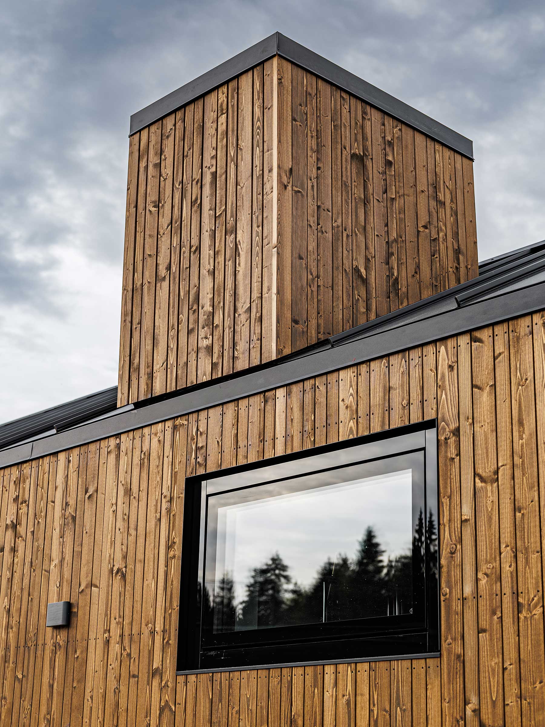
Our Exterior Maintenance Program is designed to protect your home's building envelope, enhance curb appeal, and extend the life of exterior finishes through professional cleaning, inspection, and touch-up services.
- Low-Pressure Power Washing
Gentle washing of all painted exterior surfaces using low pressure to avoid damage while removing dirt and buildup. - Walkway & Pathway Cleaning
Thorough cleaning of exterior hardscapes for safety and appearance. - Mold & Mildew Treatment
Application of biodegradable cleaners to remove surface mold and organic growth. - Gutter & Downspout Cleaning
Complete clearing of debris to ensure proper drainage and prevent water intrusion.
- Roof Debris Removal
Blower cleaning of roof areas to remove leaves and buildup that can trap moisture. - Solar Panel Cleaning (if applicable)
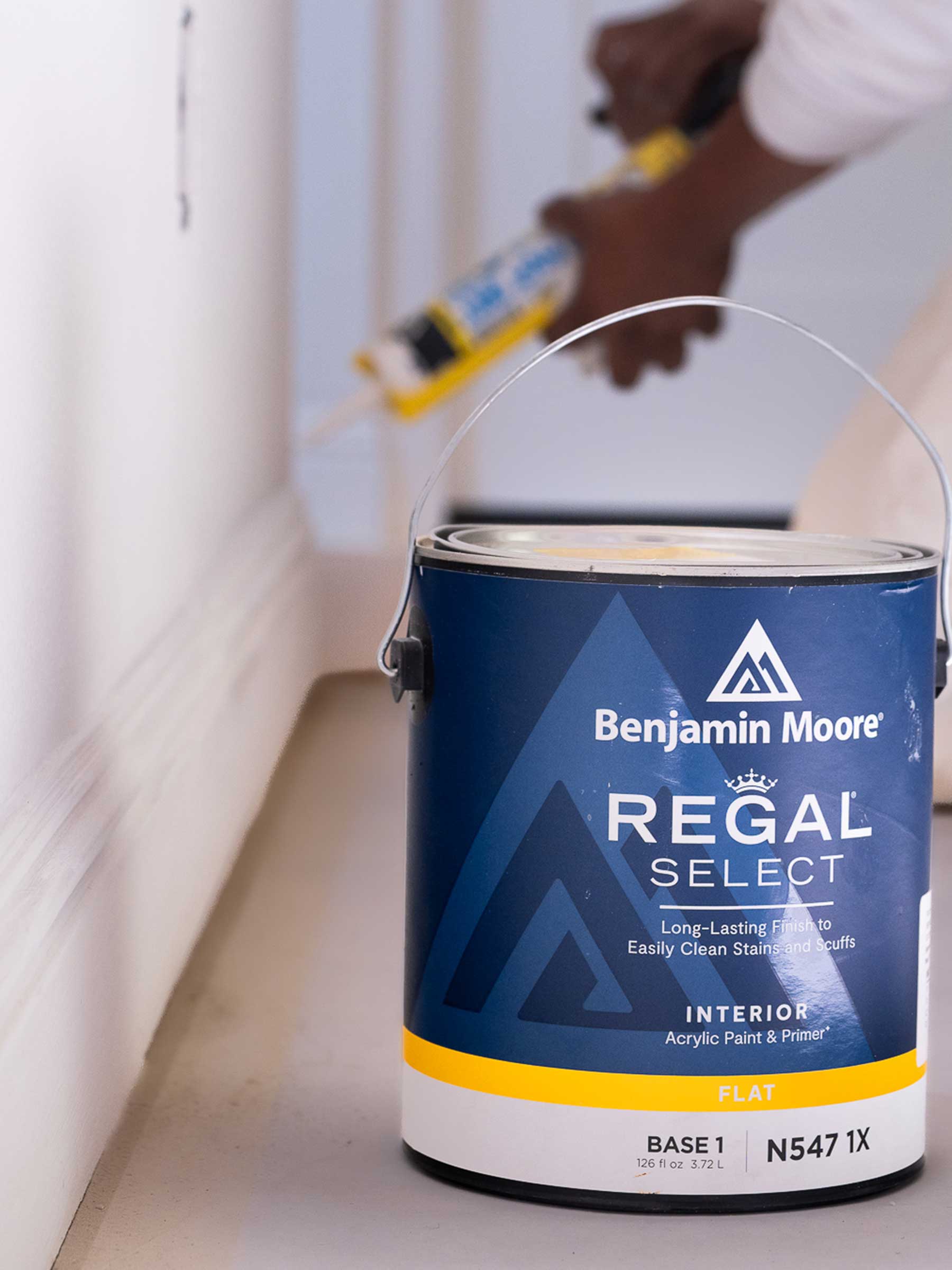
Careful cleaning to improve efficiency and maintain performance. - Paint Coating Inspection & Touch-Ups
Detailed evaluation of exterior paint conditions with minor touch-ups performed as needed to maintain protection and appearance. - Exterior Window & Door Cleaning
Professional cleaning of all exterior glass surfaces for clarity and presentation.
Schedule Your Maintenance Visit
We would be happy to arrange an on-site walk-through and customize a maintenance plan for your home.
Request an Estimate